
Travel Free
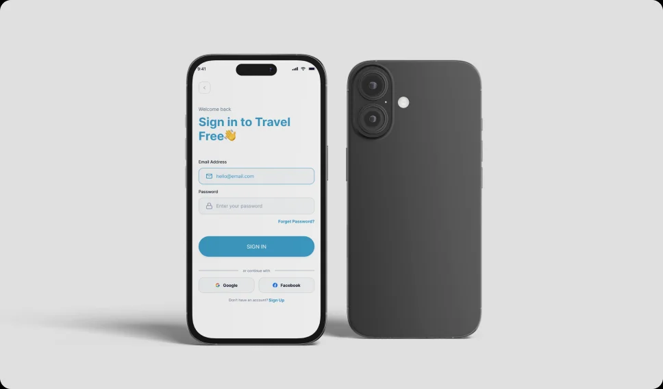
Hotel booking mobile app design concept for travel enthusiasts.
Project Overview
Turning Travel Goals Into Achievable Financial Plans
Travel Free is an all-in-one travel platform designed to streamline the entire travel experience—from inspiration to booking and post-trip management. The application integrates destination discovery, hotel reservations, flight booking, and an AI-powered assistant into a single, cohesive ecosystem. The core objective was to eliminate the fragmentation commonly experienced in travel planning. By consolidating multiple services into one intuitive interface, Travel Free enables users to move seamlessly between exploring destinations, comparing options, and completing bookings without leaving the platform. Special emphasis was placed on usability, speed, and personalization, ensuring that users can make informed decisions quickly while enjoying a visually engaging and stress-free experience.
The Problem
Eliminate Fragmentation in Travel Planning
Travel planning today is often fragmented across multiple platforms, requiring users to switch between apps for flights, hotels, and destination research. This leads to cognitive overload, inconsistent user experiences, and increased time spent on decision-making. Additionally, many existing platforms present users with overwhelming amounts of information without proper guidance, making it difficult to identify the best options. The lack of intelligent recommendations further complicates the process, especially for users unfamiliar with their destination. Travel Free addresses these challenges by creating a centralized, user-friendly platform that simplifies complex workflows while introducing AI-driven assistance to support users at every stage of their journey.
- Difficulty estimating travel costs accurately
- Lack of structured savings plans
- Low motivation to maintain saving discipline
- Financial anxiety around trip affordability
- Overwhelming planning processes
Users needed a simple system that supports both planning and motivation.
Project Goals
Make Travel Planning Financially Clear and Motivating
The primary goal of Travel Free is to design a seamless and efficient travel experience that caters to both experienced and first-time travelers.
Unification: Integrate multiple travel services into one platform to reduce dependency on third-party tools. Efficiency: Minimize the number of steps required to complete bookings. Personalization: Deliver tailored recommendations based on user preferences and behavior. Clarity: Present information in a structured and easily digestible format. Engagement: Use high-quality visuals and intuitive interactions to inspire users.
These goals guided every design decision, ensuring alignment between user needs and product functionality.

Target Users
Designed for Diverse Travel Needs
Travel Free is designed for a diverse group of users with varying travel needs and experience levels.
Frequent Travelers: Individuals who prioritize speed and efficiency when planning trips. First-Time Travelers: Users who require guidance, recommendations, and reassurance. Digital-Native Users: Mobile-first individuals who expect seamless and intuitive interfaces. Budget-Conscious Travelers: Users actively seeking deals, discounts, and value for money.
Understanding these user segments allowed for the creation of a flexible experience that adapts to different behaviors and expectations.
User Persona
Defining the Primary Travel Free User
The affinity map and research synthesis produced a clear, consistent picture of the primary Travel Free user. Rather than a broad demographic profile, the persona is defined by a specific set of behaviors, motivations, frustrations, and goals — the things that are design-relevant, regardless of age or income bracket.

My Role
Product Designer — UX Strategy & Interface Design
I designed the mobile experience from concept to prototype, focusing on clarity, motivation, and usability.
- UX research and user behavior analysis
- Information architecture and flow design
- Interaction and interface design
- Financial planning UX structure
- Prototyping and usability refinement
- Designing motivational progress systems
Research & Insights
Understanding User Motivation and Financial Behavior
The research phase focused on two areas: understanding how people currently plan and save for travel, and understanding the psychological and behavioral patterns around financial goal-setting and motivation. Both were essential — the product needed to be financially functional and behaviorally effective.
User Behaviour Research: Users set travel goals in abstract terms (“I want to go to Europe next summer”) without translating them into specific financial targets. The absence of a number made it impossible to know whether progress was being made or not.
Saving in a general savings account, without a named, dedicated pot for the specific trip, created confusion and vulnerability. The money felt available for other things, and often was. Users who had previously tried to save for travel reported that the experience felt isolating. The most motivated savers were those who had shared their goal with someone else, set a specific deadline, and could articulate exactly what they were saving for.

UX Strategy
Designing for Simplicity and Intelligence
The UX strategy focused on creating a balance between simplicity and functionality, ensuring that users can achieve their goals with minimal effort.
Centralized Experience: Bringing all travel-related services into one platform to reduce fragmentation. Guided Interaction: Using AI to assist users in decision-making and reduce uncertainty. Progressive Disclosure: Presenting information in layers to avoid overwhelming users. Consistency: Maintaining uniform design patterns for predictability and ease of use. Speed & Efficiency: Reducing load times and minimizing steps in key flows.
This approach ensures that the product is both powerful and accessible, catering to a wide range of users.

Information Architecture
Structuring the Experience
The information architecture was designed to support intuitive navigation and quick access to core features.
Travel: Personalized recommendations and featured destinations. Chat (AI Assistant): Real-time support and recommendations. Flights: Search, compare, and book flights. Hotels: Browse and reserve accommodations. Profile: User preferences and account settings.
The structure ensures a logical flow of information, reducing confusion and improving usability.

Affinity Map
Organizing User Insights
Affinity mapping was used to synthesize user research findings and identify recurring patterns.
Convenience: Users prefer having all services in one place. Speed: Quick access to information and fast booking flows are essential. Trust: Transparent pricing and reliable reviews build confidence. Inspiration: Visually rich content influences decision-making. Guidance: Users value recommendations and assistance during planning.
These insights directly influenced feature prioritization and interaction design, ensuring alignment with real user needs.

User Journey
End-to-End Travel Experience
The user journey was mapped to visualize how travelers interact with the platform across different stages. This helped identify key touchpoints, opportunities, and pain points.
Discovery: Users explore destinations through curated content, visuals, and recommendations. Planning: Users compare destinations, hotels, and flights while evaluating options based on price, ratings, and convenience. Booking: Users complete reservations through a streamlined process designed to minimize friction and errors. Pre-Trip: Users receive reminders, updates, and relevant travel information to stay prepared. Post-Trip: Users can review their experience, provide feedback, and save preferences for future trips.
Mapping this journey ensured that each stage was optimized for efficiency, clarity, and user satisfaction.

Interface Design
Designing for Simplicity and Emotional Motivation
The interface design for Travel Free was guided by a single tension that runs through all financial products designed for emotional goals: it must feel serious enough to be trusted and light enough to be loved. A product that feels too clinical loses the motivational warmth that sustains engagement over months of saving. A product that feels too playful loses the financial credibility that users need to trust it with real money.
I resolved this tension through contrast: a clean, structured layout language, generous white space, clear type hierarchy, precise alignment — combined with a warm, aspirational colour palette and photography-driven imagery that keeps the travel goal emotionally present throughout the experience.
Visual Design Principles — Minimal layouts: Content density is kept deliberately low to reduce cognitive load. Every screen presents one primary piece of information and one primary action. Secondary information is accessible but not competing.

Low-Fidelity Wireframes
Defining Layout, Structure, and User Flow
The low-fidelity wireframes were created to establish the core layout and overall user flow of the application. At this stage, the focus was on functionality rather than visuals, allowing for a clear understanding of how users would navigate through the platform. Different layout options were explored to organize content effectively and ensure that key actions such as searching, browsing, and booking were easy to access.
The booking flow was simplified to reduce unnecessary steps and make the process more efficient. The AI assistant was also positioned in a way that keeps it accessible without disrupting the user journey. Through iteration, the structure was refined to ensure clarity, balance, and ease of use before moving into the final design phase.

High-Fidelity Design
Creating a Clean and Engaging Visual Interface
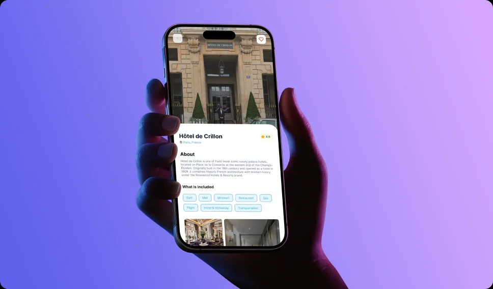
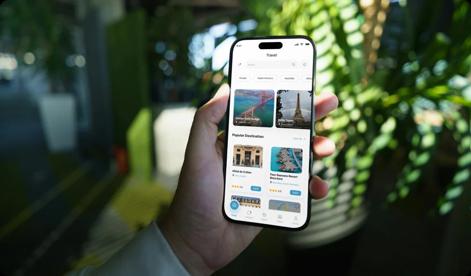
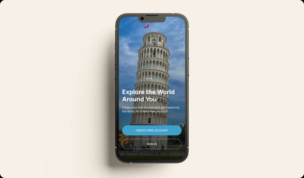
The high-fidelity design focused on transforming the wireframes into a polished and visually appealing interface. Visual elements such as typography, color, and imagery were applied to create a modern and consistent design. A clear visual hierarchy was used to highlight important actions like search and booking, making it easier for users to navigate and make decisions.
High-quality images were incorporated to enhance the travel experience and make destination discovery more engaging. Consistency across components and interactions was maintained to ensure a smooth and predictable experience. The final design balances visual appeal with usability, resulting in an interface that is both intuitive and engaging.

Impact & Expected Outcomes
Helping Users Turn Travel Dreams Into Reality
Travel Free was designed to support financial clarity and consistent saving habits.
- Increased savings consistency
- Reduced financial anxiety around travel
- Improved goal completion rates
- Stronger motivation to save
- Greater confidence in travel planning
Key Features
Core Functionalities
Travel Free offers a comprehensive set of features designed to support the entire travel journey:
Destination discovery with curated content. Flight search, comparison, and booking. Hotel browsing and reservation. AI-powered assistance for personalized support. Notifications for deals, updates, and reminders. Booking management and trip tracking.
Each feature is designed to work seamlessly together, providing a unified and efficient experience.

Lessons Learned
Travel App Must Be Simple, Clear, and Motivating
This project reinforced that financial planning experiences must balance clarity with emotional motivation. When users understand their goals and see progress, they are more likely to stay committed.
Key Metrics
Improving Financial Clarity and Saving Motivation
Measures the percentage of users actively interacting with key features during each session.
Reflects overall user satisfaction based on feedback and post-interaction ratings.
Indicates the percentage of users who successfully complete core actions such as booking or search.
Represents the proportion of users engaging with the AI assistant within a session.
Final Outcome
Delivering a Seamless Travel Experience
The final product delivers a cohesive and intuitive travel platform that simplifies the user journey from discovery to booking. By integrating AI-driven recommendations with a clean and structured interface, Travel Free enhances both efficiency and user satisfaction. The result is a platform that not only meets user expectations but also creates a more engaging and enjoyable travel planning experience.
Tools & Software
Committed to staying current with the latest design trends and technologies and continuously learn new tools to grow in my field.
Tools & Software
Committed to staying current with the latest design trends and technologies and continuously learn new tools to grow in my field.





Trusted by Teams & Brands
A selection of companies I've worked with, contributing to products, brands, and experiences that drive impact and results.




